Display Data

Introduction

PixieDust lets you visualize your data in just a few clicks. There’s no need to write the complex code that you used to need to generate notebook graphs. Just call PixieDust’s display() API, and any lay person can render and change complex table and chart displays. You can even choose from multiple rendering engines, without needing to know any of the code that makes them run. Watch this video demo:


Note

This video shows how to use PixieDust display in a Scala notebook. Full support for Scala notebooks is coming soon and will work exactly as shown.

The display() API lets you visualize and chart your data in different ways. You can invoke the display API on any object, like a Spark DataFrame or Pandas DataFrame (support for additional formats is in development). PixieDust display() then introspects the object, determines what visualizations are capable of handling the data, and makes them available as menus within the output of the cell. If no visualization is found, then PixieDust display() shows an error message. PixieDust display comes with a set of built-in visualizations like tables, bar charts, line charts, scatter plots, maps, and more.

Get Started

Once you’ve imported the PixieDust module, start with the data. Here’s some sample code that creates a data frame:

#import pixiedust display module
from pixiedust.display import *

#Create a dataframe with Quarterly sales results
sqlContext = SQLContext(sc)
dd = sqlContext.createDataFrame(
     [(2010, 'Camping Equipment', 3),
     (2010, 'Golf Equipment', 1),
     (2010, 'Mountaineering Equipment', 1),
     (2010, 'Outdoor Protection', 2),
     (2010, 'Personal Accessories', 2),
     (2011, 'Camping Equipment', 4),
     (2011, 'Golf Equipment', 5),
     (2011, 'Mountaineering Equipment',2),
     (2011, 'Outdoor Protection', 4),
     (2011, 'Personal Accessories', 2),
     (2012, 'Camping Equipment', 5),
     (2012, 'Golf Equipment', 5),
     (2012, 'Mountaineering Equipment', 3),
     (2012, 'Outdoor Protection', 5),
     (2012, 'Personal Accessories', 3),
     (2013, 'Camping Equipment', 8),
     (2013, 'Golf Equipment', 5),
     (2013, 'Mountaineering Equipment', 3),
     (2013, 'Outdoor Protection', 8),
     (2013, 'Personal Accessories', 4)],
     ["year", "zone", "unique_customers"])

Then, in a single command, you display that dataframe: dd.

#call a simple display api to visualize the data
display(dd)

display() looks up into its internal registry to build a list of visualizations that can handle a Spark DataFrame and generates the a menu toobar for each of them. The cell output looks like this:

_images/pd_chrome.png

PixieDust spins up a robust user interface that contains all the features you need to create sophisticated visualizations in just a few clicks. It contains dropdown lists and dialogs you can use to change chart type, data content, grouping, and more. Without writing a line of code, you can:

  • choose a display option: table, bar chart, pie chart, scatter plot, map, etc.
  • set data content
  • switch between rendering engines like matplotlib, seaborn, and bokeh
  • zoom in for a more detailed view

display() simplifies notebook charting in one important way: It takes only one cell to to generate hundreds of visualization options. Unlike traditional notebooks where you build a series of visualizations over several cells, PixieDust needs only one cell to generate an interactive widget which lets you turn knobs to explore the data in a myriad of ways.

Work with Tables, Charts, and Maps

Pixiedust display() provides an extensive set of graphs and visualizations.

Tables

A great place to start is to view your data in a simple table format. To do so, click the table button:

_images/display_table.png

You see extended information about your Spark DataFrame in 2 view options:

  • Schema gives detailed information about the DataFrame schema
  • Table displays a sample of the data in an easy-to-read table format

Set Chart Content

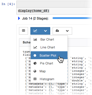
  1. Click the Chart dropdown menu and choose a chart type:

    _images/chartmenu.png
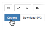
  2. Configure the content of the chart by clicking the Options button.

    _images/optionsbutton.png

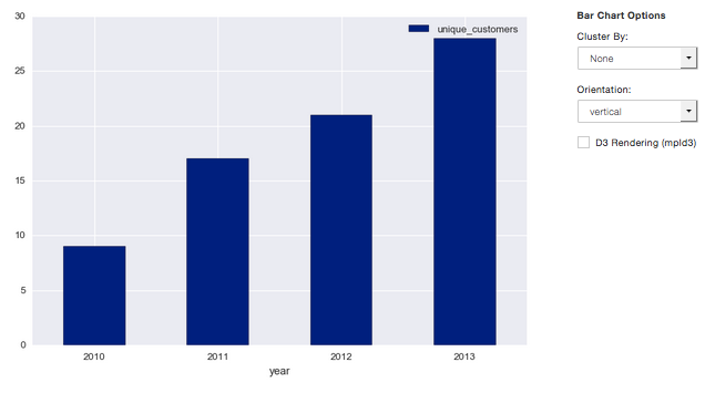
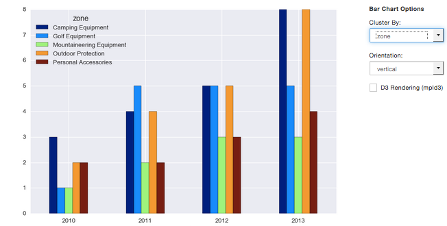
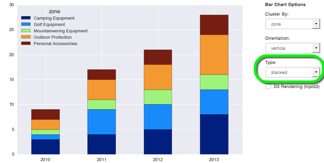
    The options dialog that opens contains a set of common configuration choices for every chart, plus a set of options specific to the chart type you selected. For example, Bar Chart shows the following options dialog:

    _images/options.png

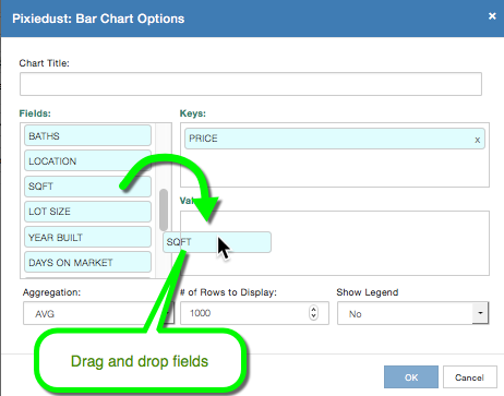
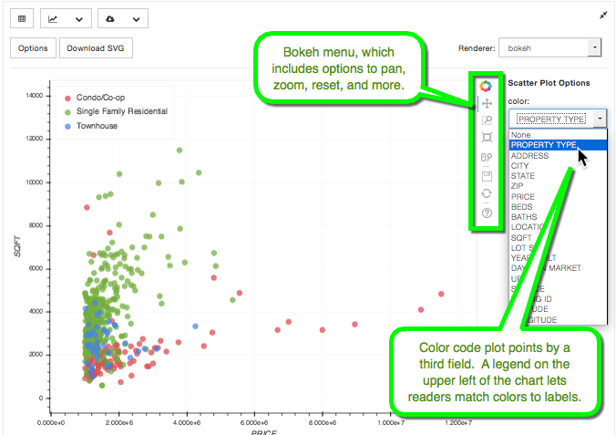
To set keys and values, drag fields from the Fields list on the left and drop them where you want them.

Set these common options for every chart:

  • Chart Title. Enter an apt, descriptive title
  • Fields. List of available field names derived from your DataFrame schema
  • Keys. Field(s) to serve as the x-Axis
  • Values. Field(s) to serve as the y-Axis
  • Aggregation. Type of aggregation to be performed on the data. Options include:
    • SUM sum or total of values for the key
    • AVG average of values for the key
    • MIN Min (lowest) of values for the key
    • MAX Max (highest) of values for the key
    • COUNT number of times the key occurs

Then choose the chart-specific options. Read on to learn how to configure individual chart types.

Note

Errors? Issues? If you get an error or encounter a problem displaying data, start troubleshooting by checking the logs.

Choose a renderer

PixieDust offers several different rendering engines you can use out-of-the-box to display your data.

_images/renderer_menu.png

The list of available renderers changes depending upon what chart type you’re viewing.

The following renderers are currently built-in:

Bar Chart

Bar charts are handy for comparing items side-by-side. In the Options dialog, set:

  • Keys: Choose a numeric field to serve as your x-axis
  • Values: Choose a numeric field to serve as your y-axis
  • Aggregation Choose to sum, average or otherwise aggregate on value you chose in keys

This bar chart shows the sum of customers rising each year:

_images/bar_chart.png

To see another dimension, click the Cluster by dropdown and choose a field. Here, clustering by zone, shows individual bars for each department/zone.

_images/bar_chart_clustered.png

You can show that cluster in different ways. Click the Type dropdown and choose one of the following:

  • Grouped to see bars for each cluster grouped together, as you just saw in the previous image.

  • Stacked to show clustered items in the same column split by color-coded segments or bands.

    _images/bar_chart_stacked.png
  • subplots to see each cluster in its own chart.

Once your bar plot apppears, you can switch between different renderers (matplotlib or bokeh).

Line Chart

In the Options dialog, set:

  • Keys: Choose a numeric field to serve as your x-axis
  • Values: Choose a numeric field to serve as your y-axis
  • Aggregation Choose to sum, average or otherwise aggregate values

Like bar charts, line charts let you cluster results to see trends in an additional dimension. This chart shows customers rising steadily over time:

_images/line_chart.png

When you cluster the same chart by zone, you can see how each individual department/zone is doing:

_images/line_chart_clustered.png

To show each cluster in its own chart, click the Type dropdown and choose subplots.

_images/subplots.png

Scatter Plot

A scatter plot charts individual data points upon a graph. In the Options dialog:

  • Keys: Choose a numeric field to serve as your x-axis
  • Values: Choose a numeric field to serve as your y-axis

Once your scatter plot apppears, you can choose your renderer (matplotlib, seaborn, or bokeh). Individual renderers include their own options, like this Bokeh chart:

_images/bokeh_scatter_example.png

Pie Chart

A pie chart is a circle graph which shows data as portions of a whole. In the Options dialog:

  • Keys: Choose the field that you want to be the labeled wedges of pie
  • Values: Choose a numeric field that you want to aggregrate on. When you put more than one field in Value, you get a separate chart for each one.
  • Renderers: matplotlib only

Map

Configuring your map, depends upon which rendering engine you choose: Mapbox or Google Maps.

Mapbox

The Mapbox renderer lets you create a map of geographic point data. Your DataFrame needs at least the following 3 fields in order to work with this renderer:

  • a latitude field named latitude, lat, or y
  • a longitude field named longitude, lon, long, or x
  • a numeric field for visualization

To use the Mapbox renderer, you need a free API key from Mapbox. You can get one on their web site here: https://www.mapbox.com/signup/. When you get your key, enter it in the Options dialog box.

In the Options dialog, drag both your latitude and longitude fields into Keys. Then choose any numeric fields for Values. Only the first one you choose is used to color the map thematically, but any other fields specified in Values appear in a pop-up information bubble when you hover your mouse over a data point on the map.

_images/map.png

Google Maps

In addition to mapping geographic points with Mapbox, Pixiedust also lets you use Google’s API to create GeoCharts, which are maps that show region blocks identified in various ways.

To create a GeoChart in Pixiedust, open Options and drag the field that has place names into Keys. Then for the Values field, choose any numeric field you want to visualize.

Within the Display Mode menu, choose

  • Region to color the entire area of your named places e.g. countries, provinces, or states.
  • Markers to place a circle in the center of the region which is scaled according to the data selected for the Value field.
  • Text to label regions with labels like Russia or Asia

Here’s a geochart (by region) of population by country:

_images/geochart_region.png

Histogram

Use a histogram if the values on your x-axis are numeric, like age or price, and you want to show them in ranges. More on when to use a histogram.

For example, here’s PixieDust’s Million Dollar Home Sales sample data set displayed in a histogram. Squarefeet ranges appear on the x-axis. The Bokeh renderer lets us show an additional dimension, Property Type, in color-coded bars.

_images/histogram.png

In Options, choose

  • Values: Choose a numeric field that you want to segment along the x-axis
  • Renderers: matplotlib, seaborn, or bokeh

Conclusion

Pixiedust display has a built-in set of chart visualizations that can render a Spark or Pandas dataframe. The generated charts are easy to configure and also offer interactivity like panning, zooming, and tooltips. You can use the rendering engine of your choice to display and manipulate the visualization. All this is possbile without writing a line of code. PixieDust display() is extensible and provides an API to let developers write their own custom vizualizations.